


Cart
0

That single move covers most of what color theory teaches. From there, monochrome, analogous, and complementary pairings just decide which colors fill those slots. Try three outfits from five pieces tonight and you will feel the difference.
TL;DR:
- Most outfits benefit from starting with one dominant anchor piece and adding only one supporting color to stay cohesive.
- Using a color wheel system like monochrome, analogous, or complementary helps achieve predictable and balanced outfit combinations.
- Neutral outfits should stay within warm or cool tones consistently to create depth and avoid accidental dullness.
- Digital tools and simple exercises can speed up matching colors, making outfit creation more efficient.
- Skin undertones influence near-face colors; warm tones suit warmer undertones, but neutrals and accents can work across all skin types.
Table of Contents
- Five Practical Ways to Match Colors in Outfits
- How Do You Build an Outfit Around an Anchor Piece?
- How to Style Neutrals Without Looking Flat
- Which Tools Make Color Matching Faster?
- How Does Skin Tone Affect Which Colors You Wear?
- How Should Occasion or Season Change Your Color Choices?
- CAS7M Perspective: Building Outfits That Match Without the Guesswork
- Ready-Made Anchors: Which CAS7M Pieces to Start With
- Sources
- FAQ
Five Practical Ways to Match Colors in Outfits
Color matching outfits gets easier once you stop treating it as art theory and start treating it as a formula. Professional stylists lean on the color wheel and its harmony systems — monochromatic, analogous, complementary, and triadic — because each one gives a predictable result without guesswork.
- Monochrome: one color family, multiple shades (navy trousers, sky blue shirt, denim jacket). Low risk, instantly polished.
- Analogous: colors next to each other on the wheel (olive, mustard, rust). Easy on the eye, great for fall layering.
- Complementary: opposite colors (burgundy and forest green, or navy and rust). High contrast, works best when one color dominates.
- Triadic: three evenly spaced colors (red, yellow, blue toned down). Bold, best reserved for statement days.
- Neutral-based: black, white, gray, camel, or beige as the whole outfit, with texture doing the work instead of color.
Every one of these maps onto the 60-30-10 rule: 60% dominant, 30% supporting, 10% accent. A complementary outfit, for example, isn’t two equal halves of green and red. It’s mostly green with red showing up only in a belt or sneakers.
Do:
- Let one color visibly lead the outfit.
- Repeat your accent color in two small spots (jewelry and shoes, for example).
Don’t:
- Split colors 50/50. It reads as costume, not outfit.
- Use more than three visible colors at once, per the same rule stylists follow to keep palettes clean.
How Do You Build an Outfit Around an Anchor Piece?
Start with your Girlshappyhour. That’s the largest garment or the one closest to your face, since it sets the tone for everything else and cuts decision time dramatically. Outfit-matching tools built around this exact logic show that once you’ve picked the anchor, the rest of the outfit assembles in under 15 seconds.
- Choose your anchor. A jacket, dress, or sweater usually works best because it covers the most visual real estate.
- Add a neutral. Black, white, gray, or camel grounds the anchor and takes up roughly 30% of the look.
- Pick one supporting color. This should relate to the anchor through the color wheel, whether analogous or complementary.
- Reserve 10% for an accent. Put it in a belt, bag, or shoes, not scattered everywhere.
- Check undertones near your face. Warm anchors near cool undertones (or vice versa) can wash you out, so test the piece under natural light before committing.
Pro Tip: Lay out five pieces you already own (one anchor, two neutrals, two accents) and build three complete outfits from them. If you can do it in under two minutes per outfit, the anchor method has clicked.
How to Style Neutrals Without Looking Flat
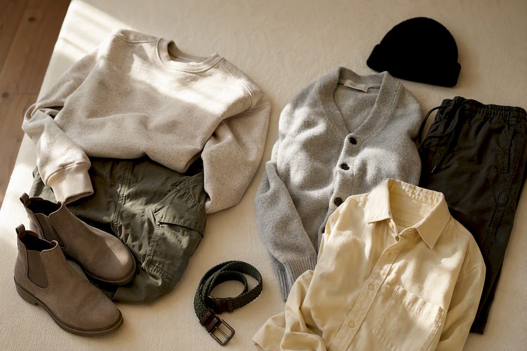
Neutrals aren’t one category. Warm neutrals (camel, cream, tan) and cool neutrals (charcoal, ash gray, true white) behave differently, and mixing the two families carelessly is what makes an all-neutral outfit look accidental instead of intentional. Neutral outfit guidance from stylists consistently points to one fix: stay within one temperature family, warm with warm, cool with cool, for the most cohesive result.
What actually creates depth in a neutral outfit:
- Mixing fabric weights (a chunky knit over a smooth cotton shirt)
- Repeating one texture detail, like ribbing or seaming, across two pieces
- Layering tonal shades instead of matching one flat gray
Neutral palettes win on versatility. The trade-off is that they demand sharper fabric choices, since a flat cotton-on-cotton neutral outfit can look unfinished in a way a colorful one rarely does.
Three combinations worth copying: cream turtleneck with camel trousers and tan boots; charcoal sweater with black denim and a gray scarf; white shirt with beige trousers and a woven belt in a slightly darker tan.
Which Tools Make Color Matching Faster?
A color wheel for outfits is the fastest way to generate a palette without guessing. Line up two adjacent colors for analogous, opposite colors for complementary, or three evenly spaced ones for triadic, and you have your 60-30-10 map before you open your closet.
Beyond the wheel itself, a few free digital tools speed this up further:
- Outfit color combination generators that suggest full looks, including accessories, based on the color you start with, similar to what outfit-matching tools provide.
- Palette-based matchers that output tonal, balanced, or bold combinations depending on how much contrast you want, a feature built into tools like Creshy’s outfit color matcher.
Two drills build speed without any app:
- The three-outfit shuffle: pick five garments, force yourself into three complete outfits, and notice which combinations you reach for twice.
- The anchor swap: keep the same neutral and accent, but change only the anchor piece, and watch how the whole mood of the outfit shifts.
How Does Skin Tone Affect Which Colors You Wear?
Skin tone matters most for what sits closest to your face, not for your entire wardrobe. A color that looks muddy against your jawline can look fine on your shoes.
The simplest check is undertone: warm undertones (gold, peach, olive undertones) generally look brighter in warm colors like rust, olive, and warm reds, while cool undertones (pink, blue, or neutral undertones) tend to pop more in jewel tones, true blues, and cool pinks. This isn’t a hard rule; it’s a starting filter. Color theory applied to clothing treats undertone and seasonal color concepts as tools to decide what goes near your face, not as a permanent ban list.
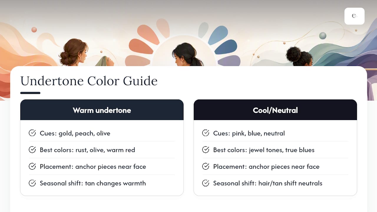
Practically, that means your anchor piece (a jacket, blazer, or top) deserves more undertone thought than your neutral trousers or your accent shoes. If a color you love genuinely drains your face, push it down the outfit instead of cutting it entirely: swap that emerald sweater for emerald accessories.
Personal coloring also shifts with the seasons, since a tan changes how warm tones read against your skin, and hair color changes can shift which neutrals look sharp versus dull. Reassess your go-to neutral every few months instead of assuming last year’s palette still fits.
How Should Occasion or Season Change Your Color Choices?
Occasion decides how much contrast you can get away with. Work and daytime settings favor analogous and neutral-based combinations because they read as put-together without demanding attention. Evening events and celebrations are where complementary and triadic pairings earn their place, since bold contrast photographs well and suits a shorter window of wear.
Season shifts the palette itself. Fall and winter lean toward analogous warm tones (rust, olive, burgundy) or cool-toned monochrome (charcoal, navy, black), while spring and summer open the door to brighter complementary pairs since lighter fabrics carry saturated color without feeling heavy.
A practical seasonal habit: keep one consistent neutral wardrobe year round, then rotate only your supporting color and accent by season. Camel trousers work in October with a burgundy sweater and again in April with a soft green top.
CAS7M Perspective: Building Outfits That Match Without the Guesswork
Every CAS7M piece gets designed with the anchor-first logic in mind. We build sets where the main garment does the heavy lifting, the neutral layer grounds it, and one deliberate accent finishes the look, because that’s the fastest route from closet to confident.
Our two-piece sets and drawstring hooded sets work as instant anchors: one dominant color, already color-blocked or solid, that removes the guesswork of matching separates. Our shorts suits function the same way for warmer months. The goal isn’t more choices. It’s fewer decisions that still look intentional.
— CAS7M
Ready-Made Anchors: Which CAS7M Pieces to Start With
Theory is one thing. Standing in front of your closet at 7 a.m. is another. If you want pieces that already do the anchor-and-neutral work for you, start with three from the CAS7M lineup.
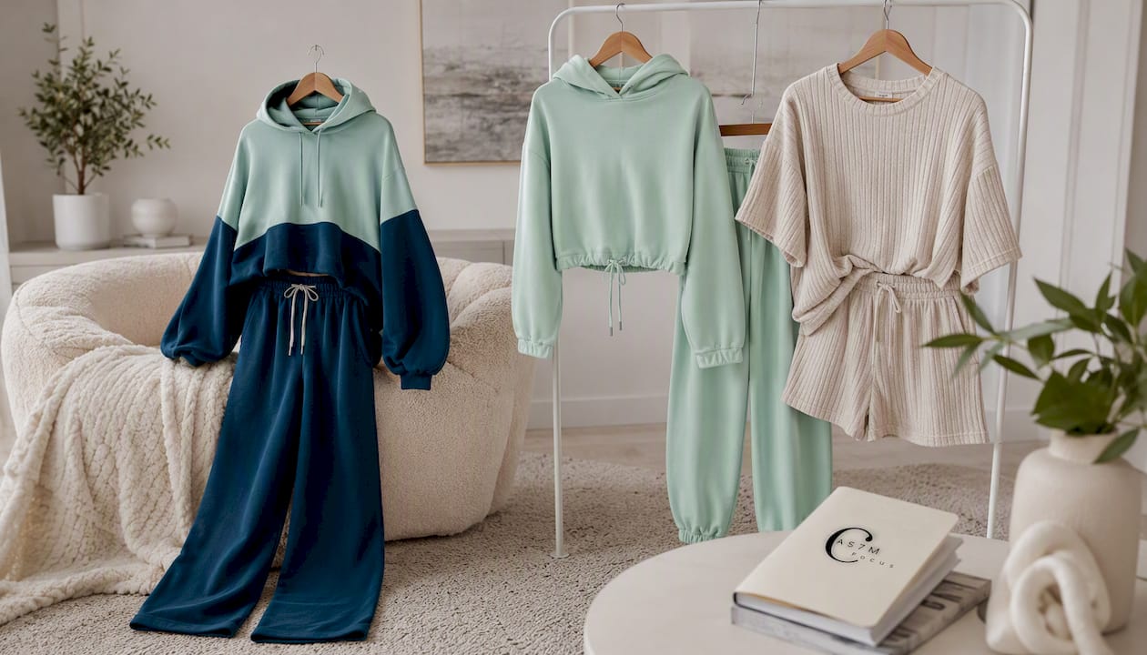
The color-blocked hoodie and wide-leg pants set works as a built-in anchor and support pairing in one purchase; the color-blocking does the 60-30 split for you, so all you add is a neutral sneaker or accent bag. The pure color drawstring hooded sweater set leans neutral by design, a solid tone you can build a monochrome or analogous look around depending on what you layer over it. And the solid color shorts suit is the easiest warm-weather anchor in the lineup: one dominant color across the set, leaving your 10% accent to shoes, sunglasses, or a bag.
Unlike piecing together separates from three different stores and hoping the undertones match, a CAS7M set gives you the anchor and support colors already resolved. Add your own neutral and one accent, and the outfit is done. Browse the full CAS7M collection and pick one set as your next anchor piece.
Sources
- Color Calculator — Sessions College
- How to Master Color Theory in Clothing Like a Vogue Fashion Editor | Vogue
- Neutral Outfit Ideas: How to Build Outfits Around Quiet Colour in 2026 - Fashion Gone Rogue
FAQ
How Can I Match Colors in Outfits?
Pick one anchor garment, ground it with a neutral, add one supporting color, and reserve a small accent using the 60-30-10 rule as your ratio guide.
What Is the 3-3-3 Rule for Clothes?
There’s no single agreed definition of a “3-3-3 rule” in fashion; most stylists instead follow a related principle of limiting an outfit to three visible colors or fewer to keep it cohesive.
What Makes a Woman Look Wealthy?
Polished color coordination reads as intentional rather than expensive: a tight neutral palette, one repeated accent color across small details like shoes and jewelry, and quality fabric texture, all signal put-together far more than logos or price tags do.
What Is the 3-Color Rule in Fashion?
The 3-color rule limits a visible outfit to three colors, typically one dominant, one supporting, and one accent, which keeps combinations from looking cluttered or costume-like.
Do I Need to Match My Outfit to My Skin Tone?
Not entirely. Undertone matters most for what sits closest to your face, so a color that doesn’t flatter you directly can still work as an accent lower in the outfit, like shoes or a bag.

